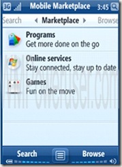
Impressions of leaked pictures of Windows Mobile 7
I’m I was a bit torn on whether or not the pictures that WMPoweruser.com found of Windows Mobile 7 are legit. The pictures, which I’ve posted below, are radically different than Windows Mobile 6.5, which Microsoft is promoting and scheduling to release at the end of 2009, so I wonder why Windows Mobile 7 seems to be a significant change from that.
The screenshot dominated by blue looks pretty decent. The “I am @” feature looks especially intriguing; I’m thinking of a Brightkite-like feature, instead of a Google Latitude–like feature. Location-based features are the thing these days, and I think it’s astonishing to think that neither Google nor Microsoft have implemented an advertising feature. I can think of two ways off the top of my head involving location-based services that could drive a new stream of revenue: targeted ads and an SMS coupon service. (I’ll save the details for these two ideas for a later post.)
The magnifying glass is definitely the right way for Microsoft to push Windows Mobile users to use Live Search. By putting an icon in an easy-to-find spot that is preconfigured into the operating system, and not offered as an add-in, it really provides ease of access and greater market share in the online search business.
I’m not too keen on the battery meter bar or the volume bar on the bottom of the screen. I think the battery meter bar should be on top, with just a horizontal or vertical battery icon that shows the status of the battery. Bars should be only for signal strength. The volume bar should appear in the middle of the screen when the person using the phone adjusts the volume with a hardware button on the phone or an icon on the phone, similar to what we have now, but one that’s easier, finger-friendly, and consistent with the overall look and feel of Windows Mobile 7.
More recently are these pictures from WMPoweruser that are consistent with the previous set of images.
To me, these images all but confirm that this is what Windows Mobile 7 will look like. I’m excited to see what’s in store beyond these screenshots because I think the mobile operating system will no longer have to hide behind OEM skins and developer themes to make Windows Mobile attractive in a competitive market.


0 Comments:
Post a Comment
<< Home